Project Context
The City of Boston’s Department of Supplier and Workforce Diversity (DOSWD) recently transitioned from a paper form to an online form. Certification is essential for ensuring equitable funding opportunities for marginalized enterprises in Boston, the program has not been utilized to its full capacity.
My Role
Team Lead, UX/UI Designer, Desktop Design
Team
5 UX/UI Designers
Timeframe
3 Weeks

Research & Findings
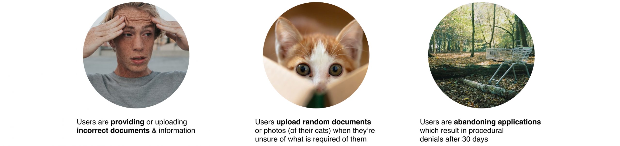
From 3 stakeholder interviews my team was able to focus on three main problem areas:
We considered two user personas, born from the synthesis of the research conducted. Their main characteristics were differentiated by confidence level.
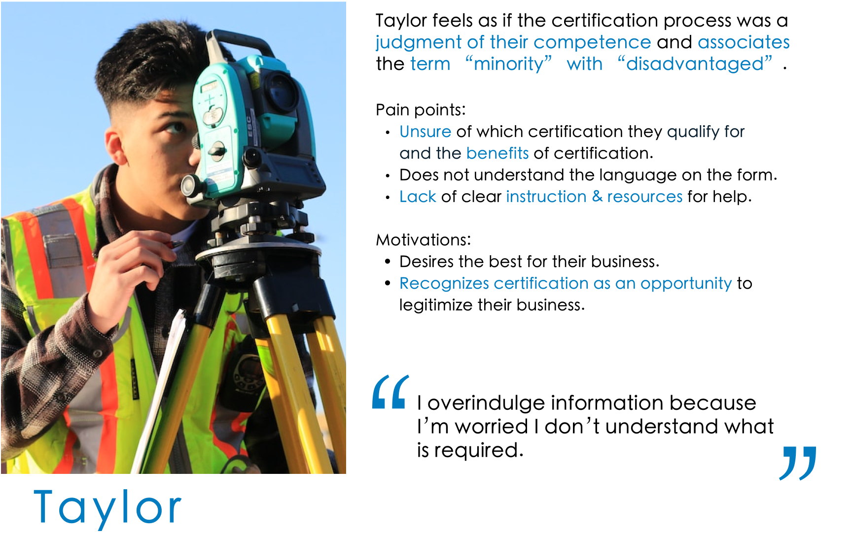
Taylor
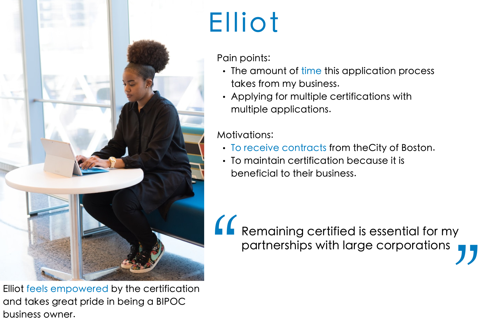
Elliot
I thought this was the most interesting piece of information gleaned from our user research. We decided to focus on Taylor as our primary persona in order to address the perception of judgment and create a more inclusive application.
Ideation & Design
Design Studio with DOSWD Team
Focus: Home Page & Confirmation Page
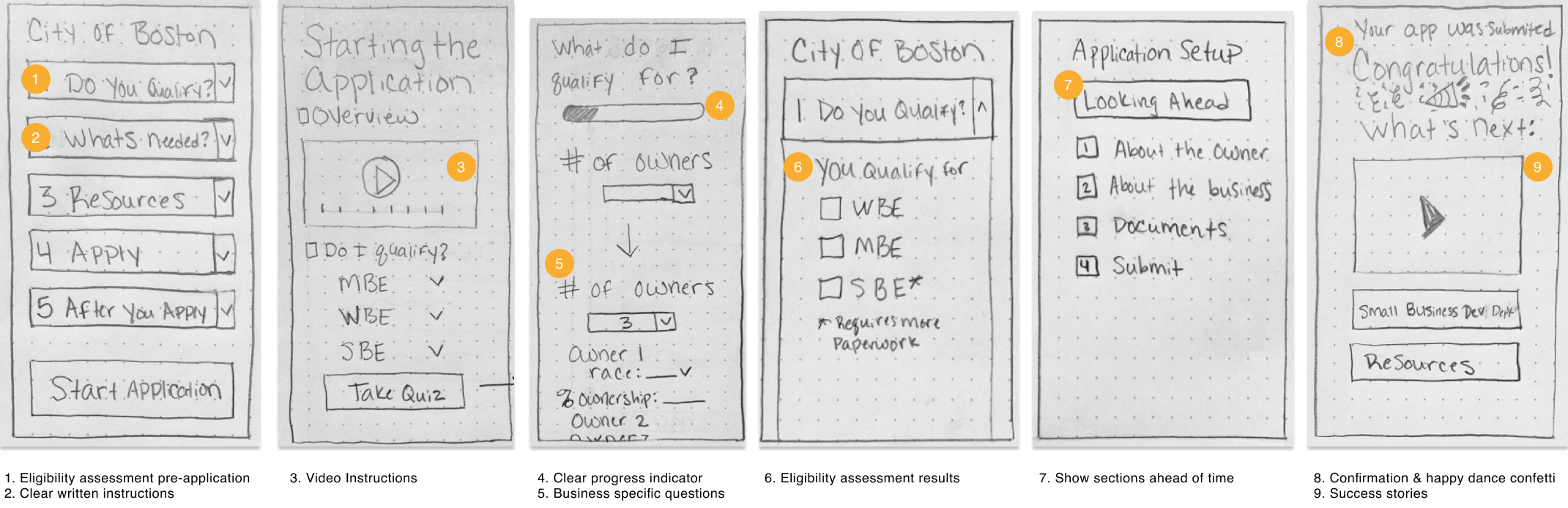
Key Takeaways:
- Eligibility assessment before the form
- Written and video instructions & explanations
- Make the process goal-oriented
- Benefits of certification before applying
- Show sections ahead of time
- Emphasize proper documentation
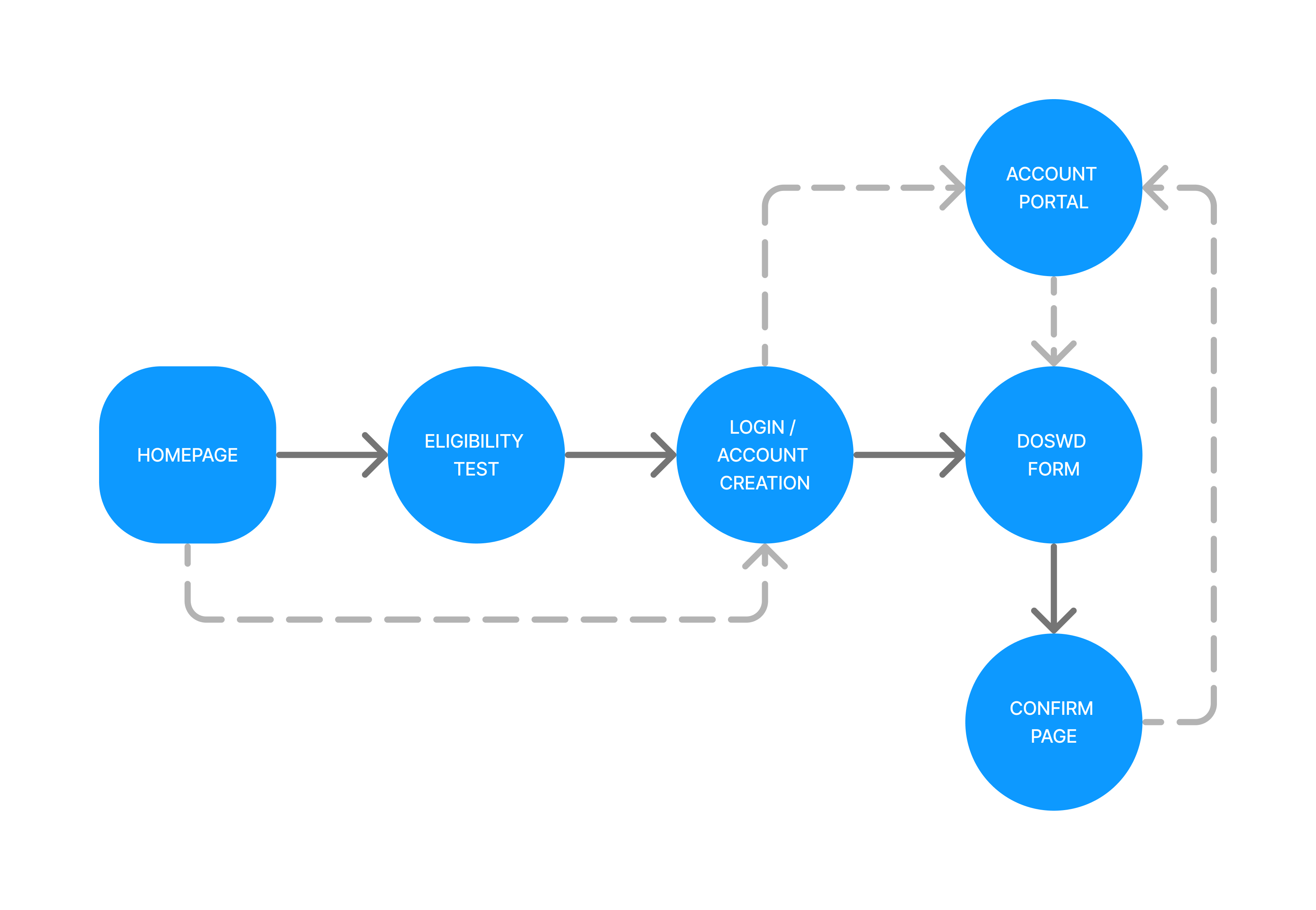
User Flow
To replace confusion with confidence, we created a brief eligibility assessment that answers the users’ question regarding which certification they qualify for. After completion and account creation, the user’s application will automatically adjust for the specific certification(s) they qualify for.
Sketching to Digital
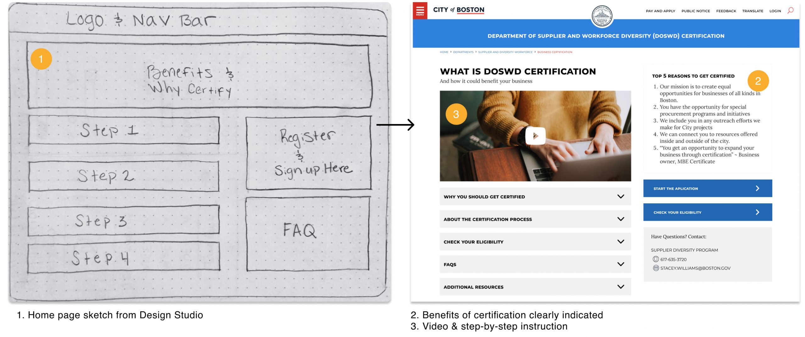
Homepage
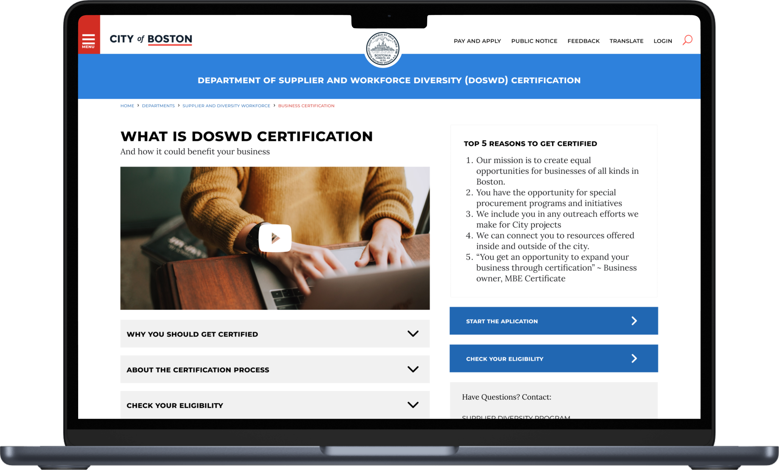
We minimize the burden of research by incorporating “The Top 5 Reasons to Get Certified” along with an introductory video on the home page.
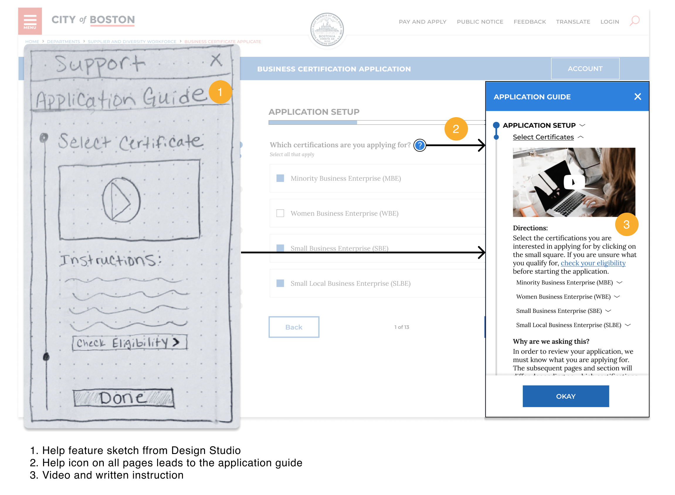
Help Feature
FAQ available on the Home page and a robust Help feature available throughout the application will take the guesswork out of what documents are required.
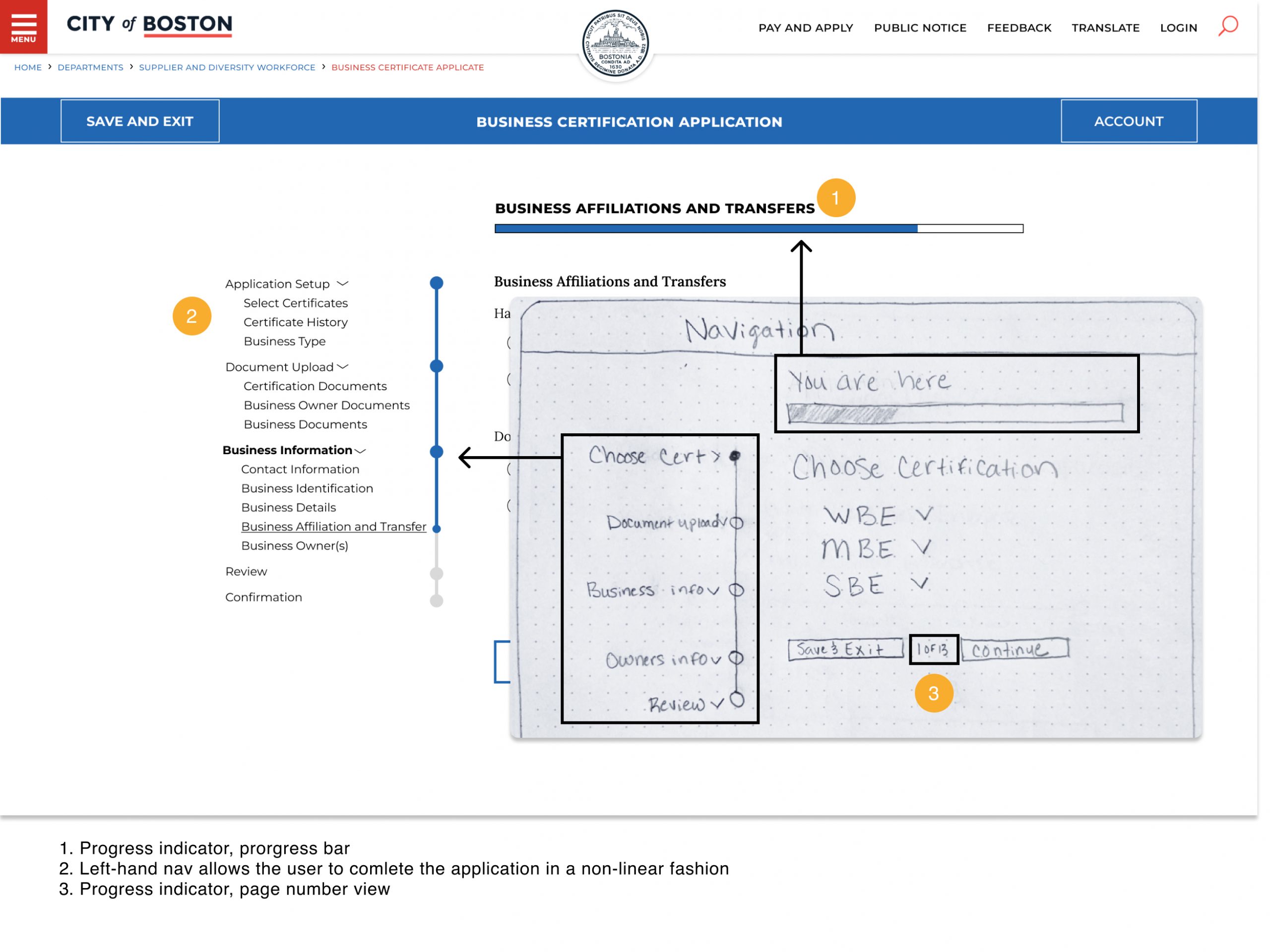
Navigation
Incorporating clear Navigation keeps the procedure goal-oriented and empowers the users autonomy of the certification process.
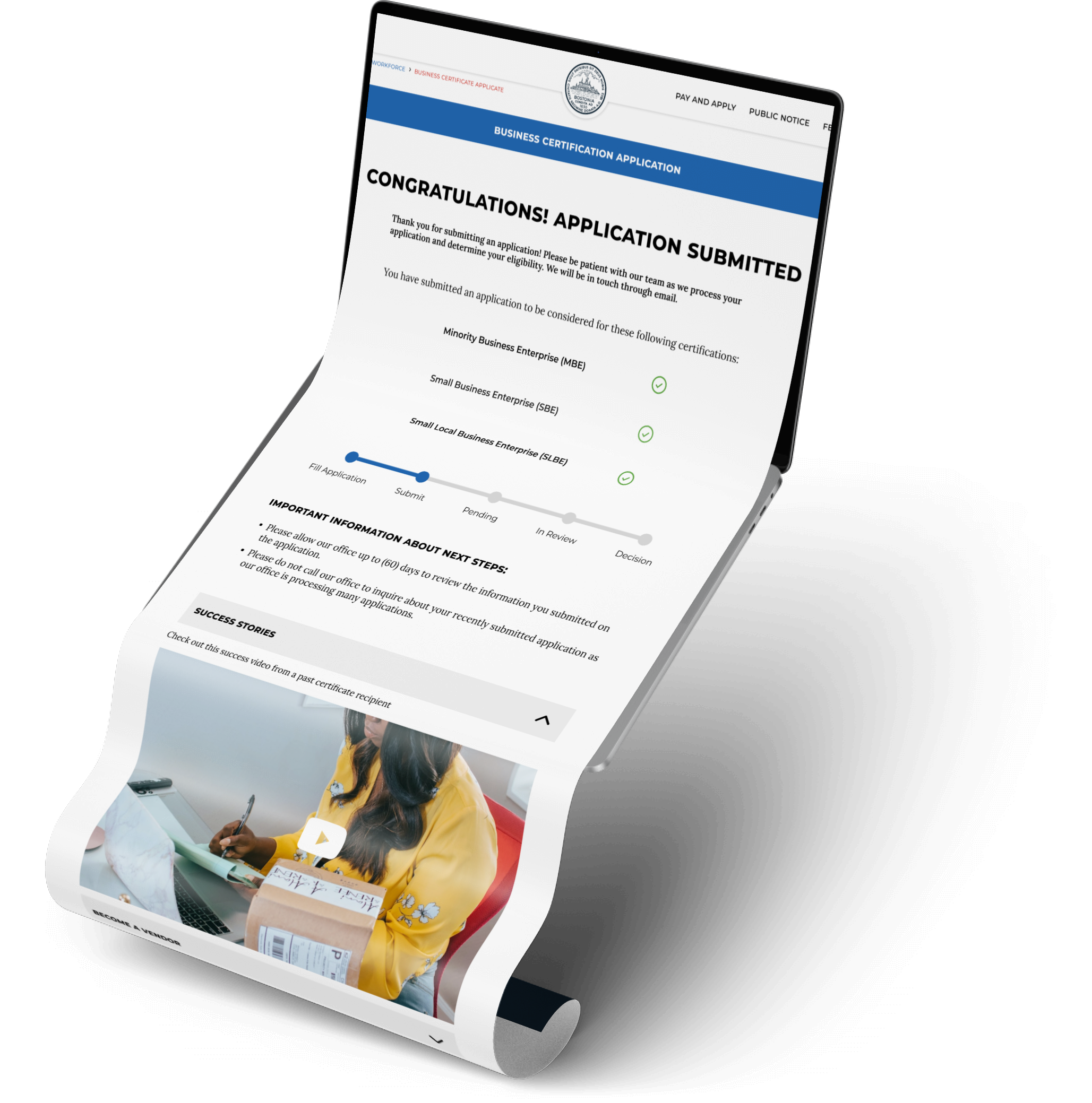
Success Stories
We include success stories at the end of the application to reiterate the value of the certification and to acknowledge the user’s effort.
Visual Design
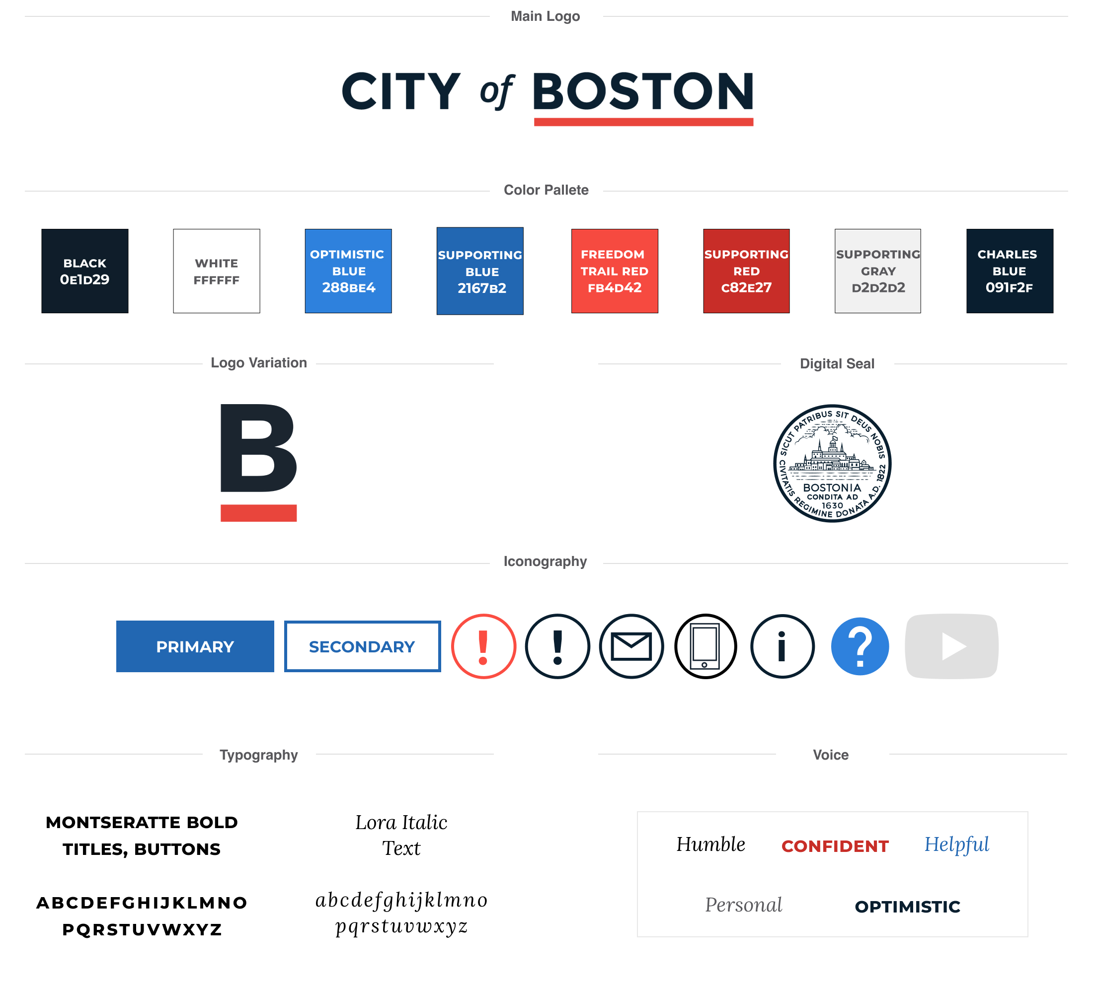
Visual Design and voice was derived from the City of Boston’s brand guidelines. Based on user research, we found leaving the COB website and entering a third party site was confusing. Users were unsure whether this certification was through the DOSWD or an unidentified third party.
Testing & Iterations
We conducted two usability tests using Maze.
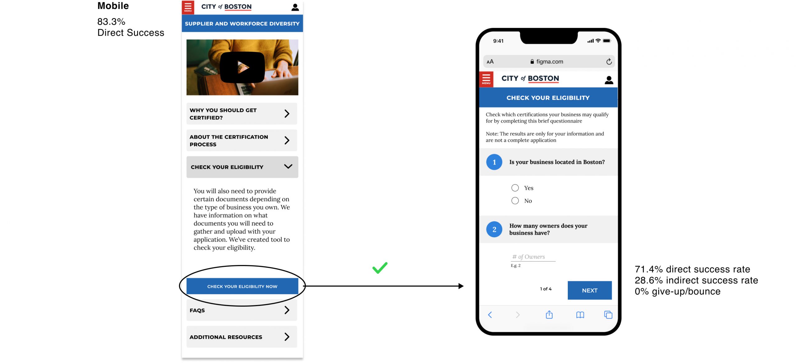
When tasked to find what certification they qualified for, users did not follow the happy path. Interestingly, when the same users tested the mobile application with the same task, they were forced to scroll through the content – and usability was much higher. After simply adding the “Check your Eligibility” button under “Start your Application” the direct success rate improved to 98%. And the bounce rate decreased over 8%.
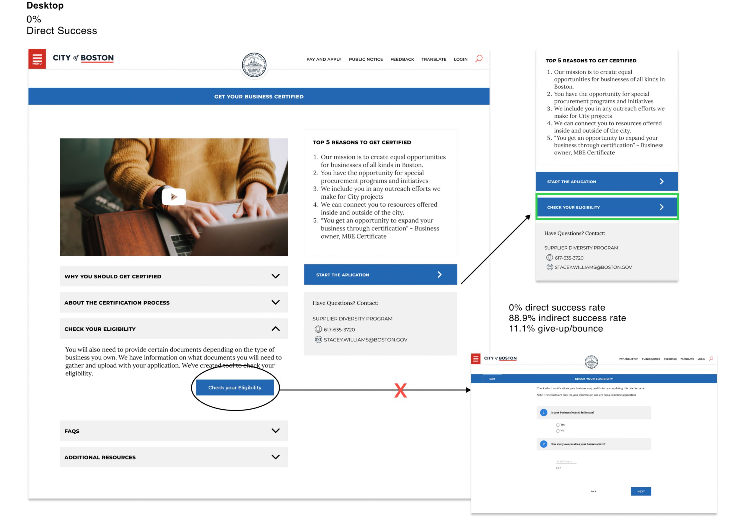
Desktop usability was generally high, so we focused on building out the help feature after our first round of testing and iterations. If time and resources had permitted, I would have liked to test the usability of current certificate holders to compare their experience with final design iterations.
Reflection
Presenting the project to our client was a highlight of the project. The DOSWD team was blown away by the volume and quality of work produced in the 3 week sprint. It was incredibly rewarding to receive such positive feedback from our client. Ask me about how this project helped me grow personally and professionally.