Project Context
Whether customers are opening an account for the first time, or preparing for retirement, now more than ever, it’s important to have your banking information at hand any time of day or night. Liberty Bank wants to offer customers a digital-first solution for all of their banking needs, from education services to saving for retirement.
View Prototype
Role
Team Lead, UX/UI Design, Budget tool & Service Design
Team
3 UX/UI Designers
Timeframe:
2 weeks
Problem
Liberty Bank wants to offer customers the services and convenience of a brick & mortar bank in a streamlined digital experience.
The Solution
Mobile-first application that addresses our users’ top 3 priorities & pain points:
- ease-of-use
- overview of all assets in one convenient place
- access to education & budgeting tools.
Throughout this case study, I’ll be focusing on the assets that I delivered.
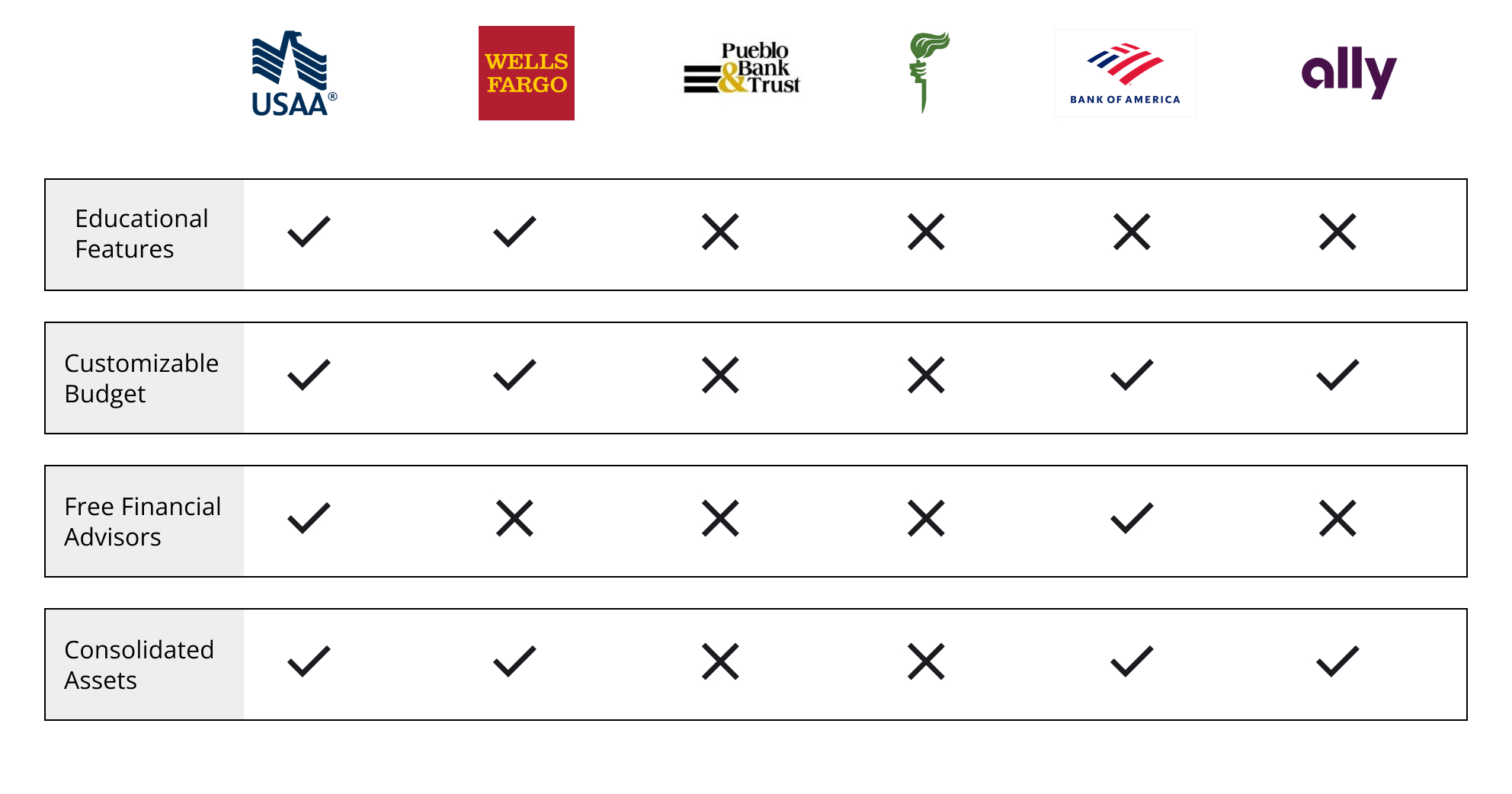
Best In Class
Of the twelve user interviews we conducted, 100% of users used large national banks. We heard that most users were happy (enough) with their current banking solution – and were not planning on switching banks.
So I turned to a feature analysis to supplement our user research with the intention of finding out what large national, mobile-first banks are doing right. Most banks offered the following that Liberty Bank doesn’t currently offer:
- Financial education & youth education
- Customizable budget and tracking
- Online bill pay
- Send/receive money
Defining Our User
Nathan – a new parent who is budget-conscious and needs to make their dollar stretch.
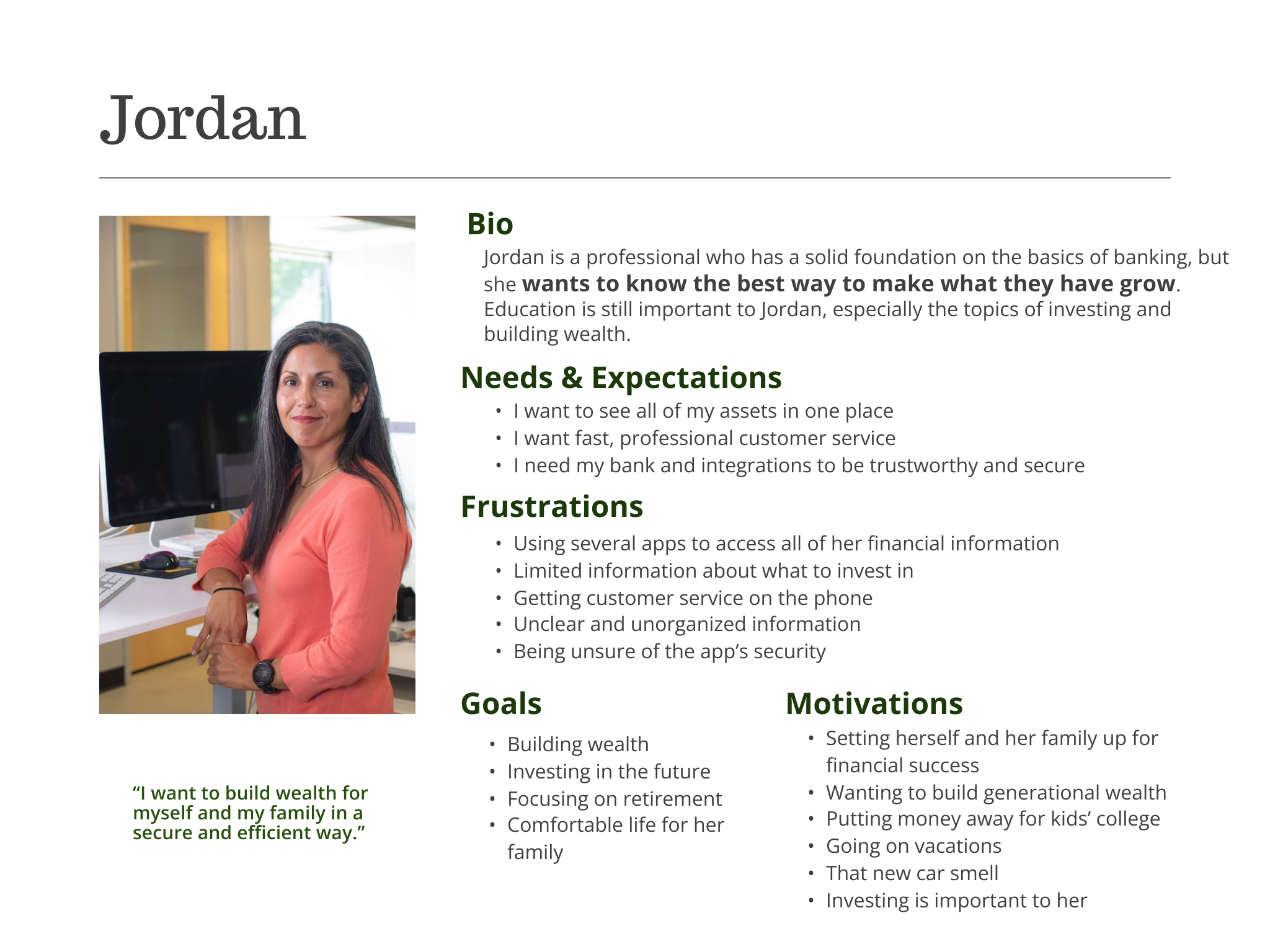
Jordan – a business professional, Jordan wants to make the most of what she has and watch it grow.
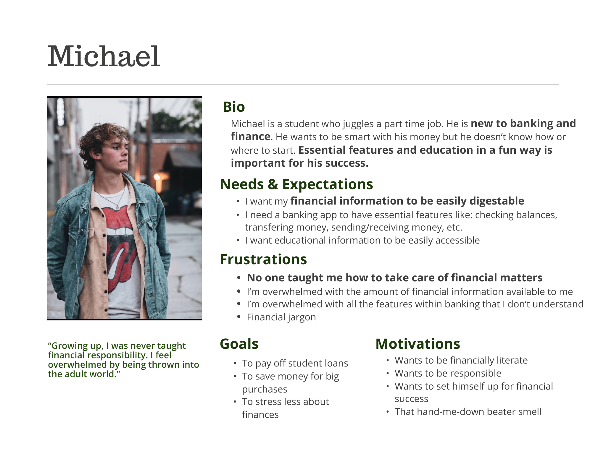
Michael- who is new to banking and finance.
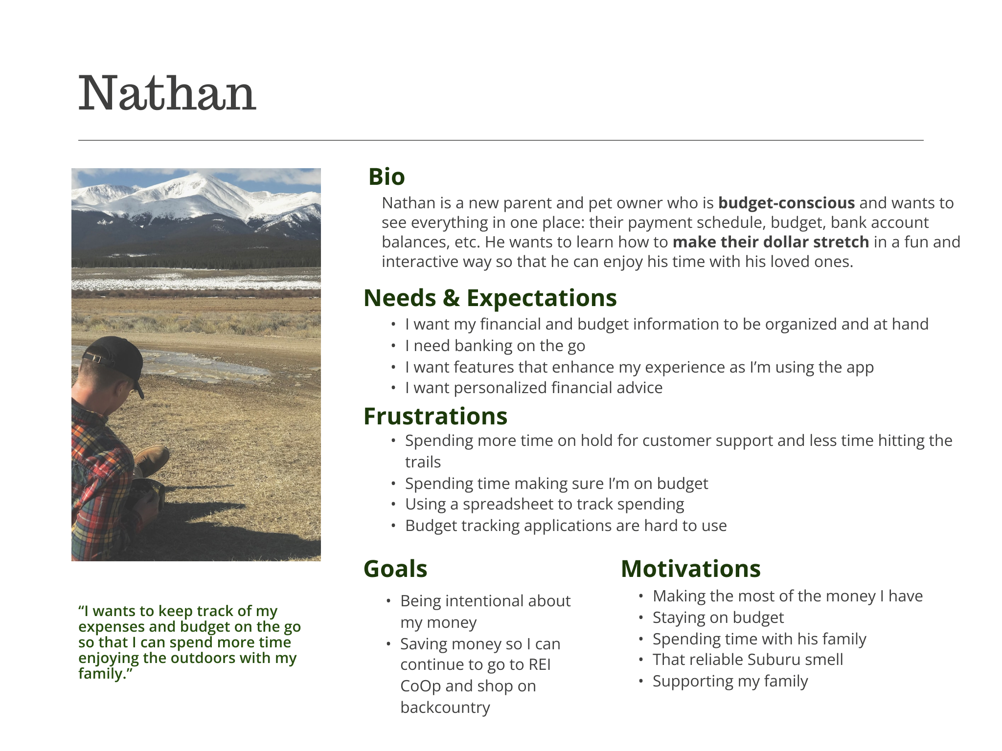
Nathan
Jordan
Michael
Ideate & Design
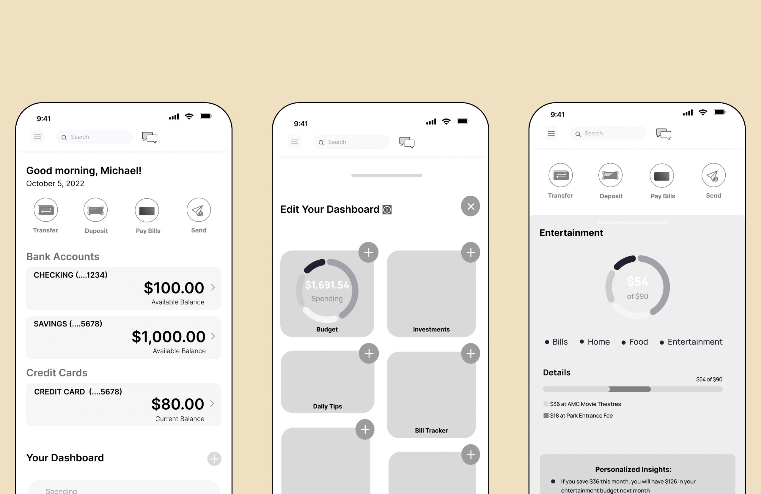
Plan, Learn, Grow – In One App
We created a plan to accommodate all three users that entailed a learning, budgeting and investing tool. The introduction of a widget on the homescreen seemed the most appropriate for meeting all three users’ needs. This made the homescreen completely customizable and unique to the individual user.
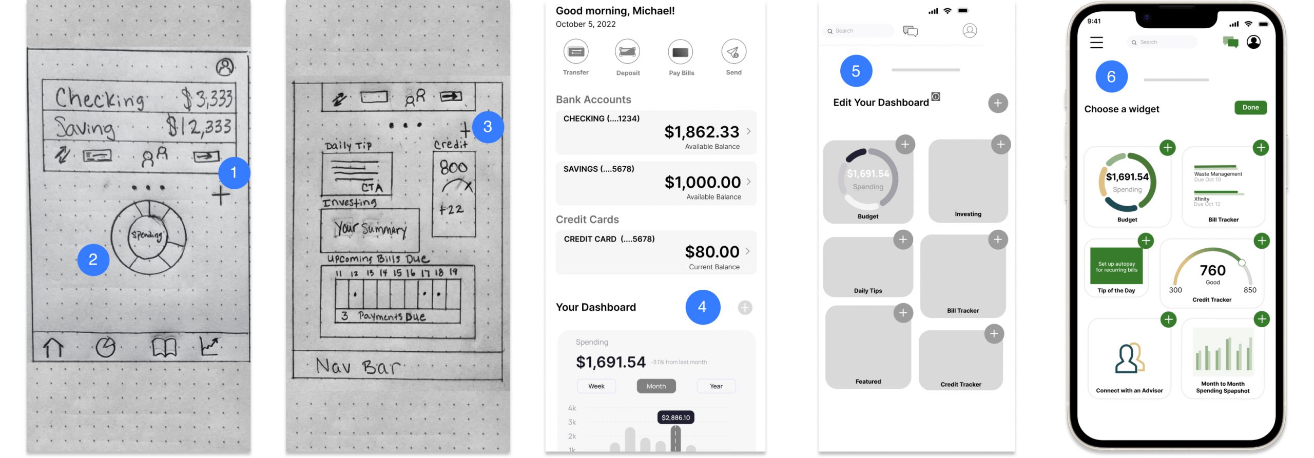
- Homescreen sketch
- Spending widget
- Customizable widgets
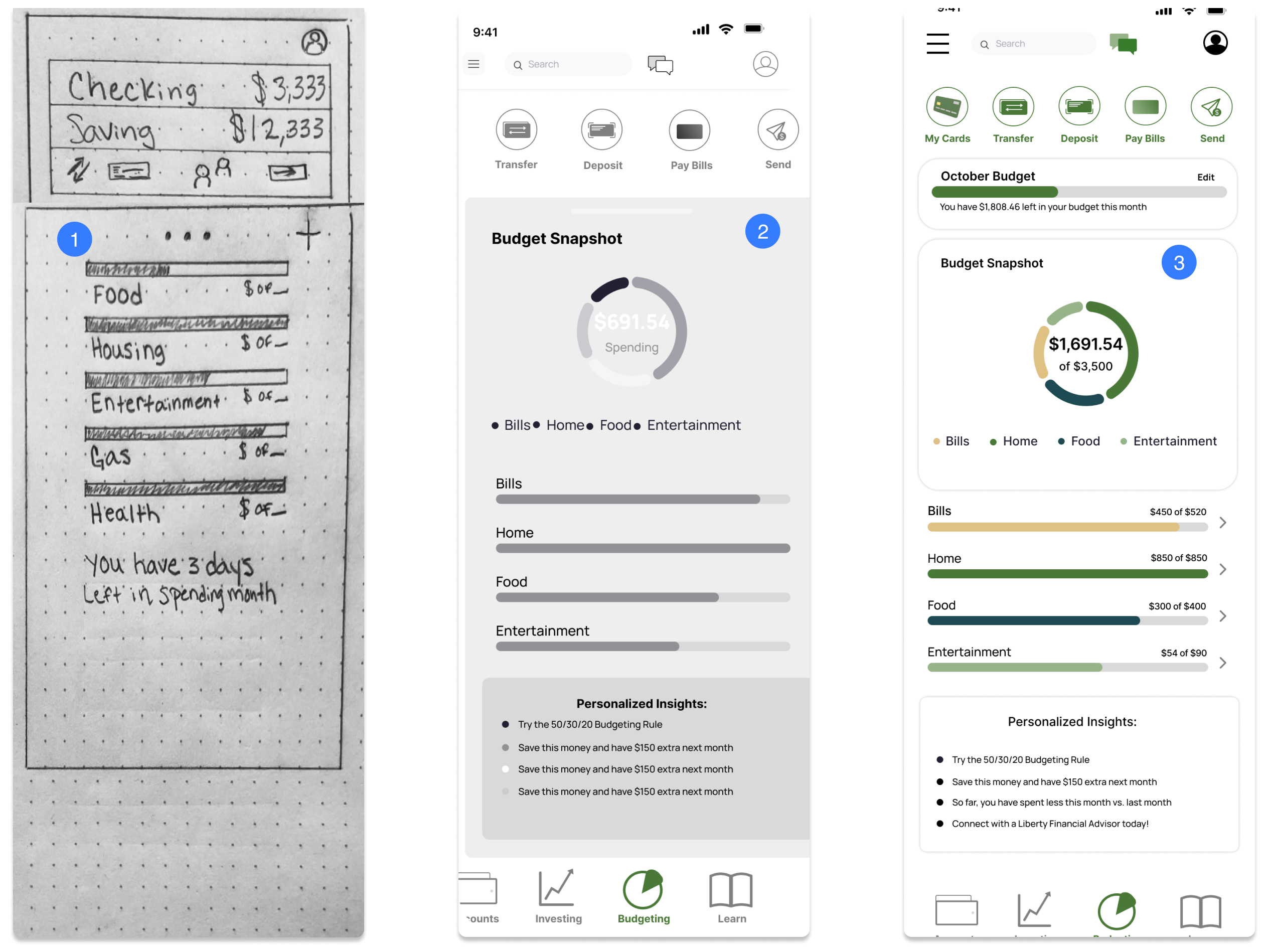
- Lofi wireframe of homescreen with spending widge
- Lofi Dashboard in edit mode
- Hifi Dashboard in edit mode
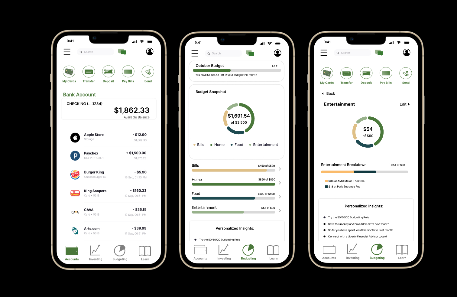
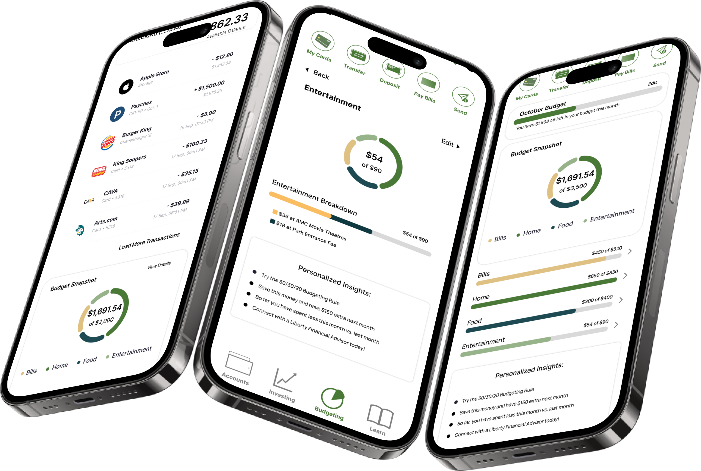
Budgeting Built-in to Everyday Banking
Gone are the days of toggling between apps in order to nail down the monthly budget. With just a little footwork upfront, our user has the ability to keep track of their expenses and income, plan for all of life’s expenses and reach their goals in no time.
- Homescreen sketch with categorized spending
- Lofi wireframe of budget page
- Hifi budget page
Trust and Professionalism
Service Design
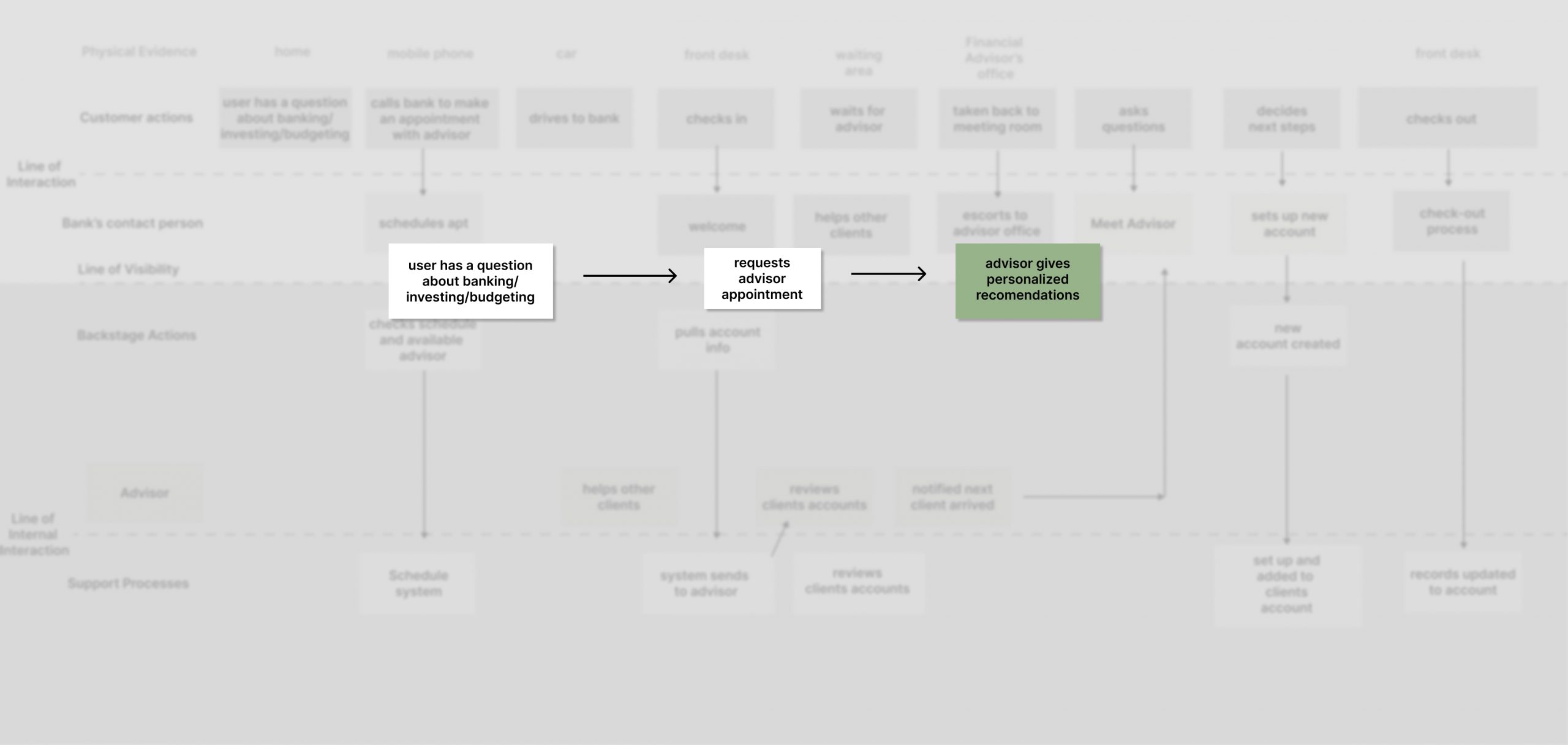
Our users gain confidence with their bank through security and professionalism but dread calling & waiting on customer service. They want fast, professional service on their terms. However, some users are unaware of banking features available to them (CDs, HYSA). Implementing a robust customer service feature allows the user to make an appointment with a financial advisor, chat with a representative, or schedule a call with a customer service agent as soon as one is available. This saves time and drives sales.

Other Considerations
Like other small banks, LB does not currently offer youth education or tax education and resources, something my team would have liked to explore if time would have permitted. Accessing educational resources and outside investment accounts were addressed in our design, but not in the case study.

Testing & Iterations
Tool: Maze
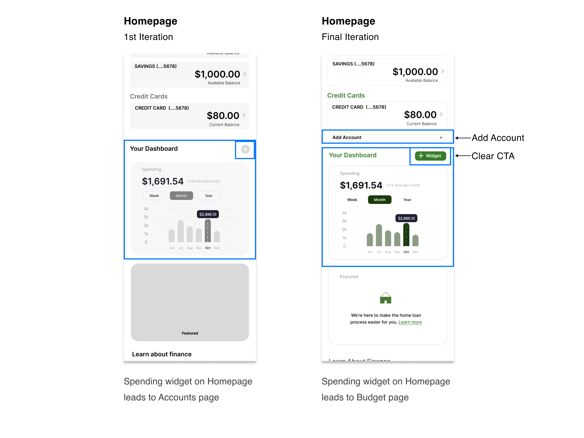
- Linked the Spending Widget to the Budget Overview page
Users didn’t know they could change/add widgets
- Changed color of button & added + Widget
There wasn’t an evident way to add a new account
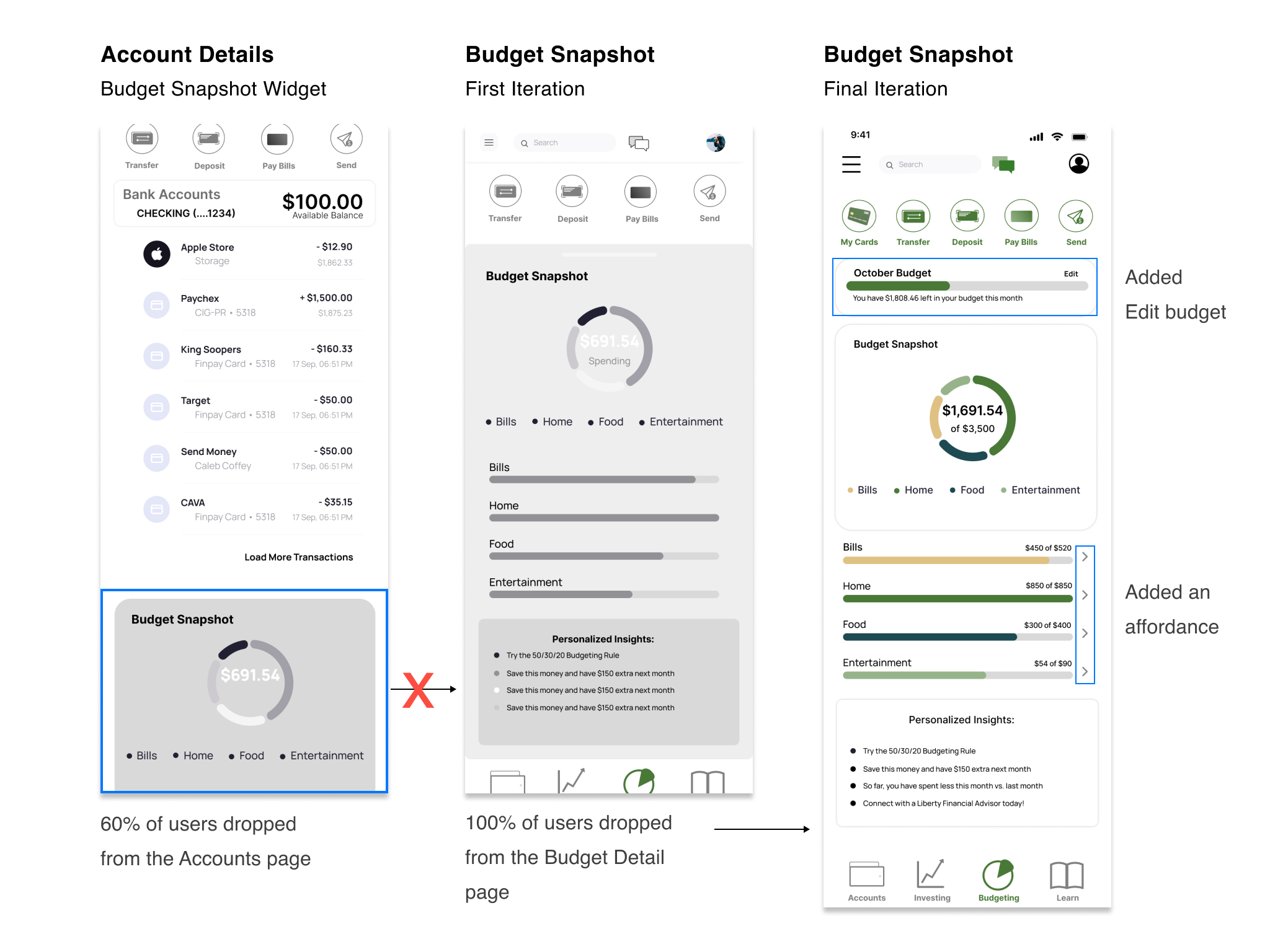
- Added clear section under Accounts
Users would drop after the Account Details page
- Users didn’t know the Budget Snapshot Widget was interactive
- Added an affordance (not shown here)
The 40% of users who found the Budget Snapshot page did not continue to the Budget Details page (not shown here)
- Added affordances to show each category was interactive
Reflection
Accessing educational resources and outside investment accounts were addressed in our design, but not in the case study. Similar to other small banks, LB does not currently offer youth education or tax education and resources, something my team would have liked to explore if time would have permitted.
Moving forward I would like to continue working on building out the budget feature and continued user testing.